Creative
Digital Marketing
Events & Exhibitions
Media & Comms
Research & Strategy
Video
News
The latest news, thoughts and expert opinion from inside CWA.
CWA News & Events
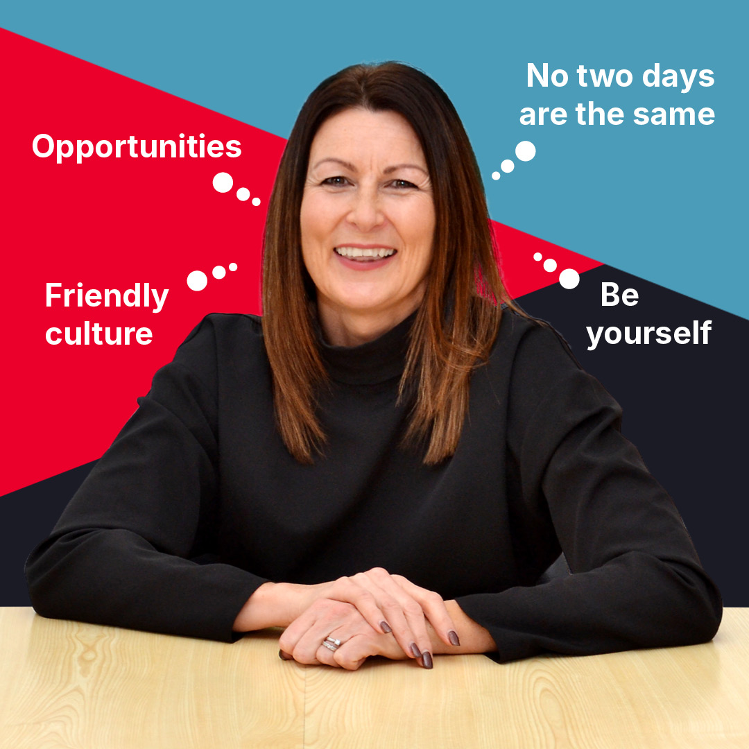
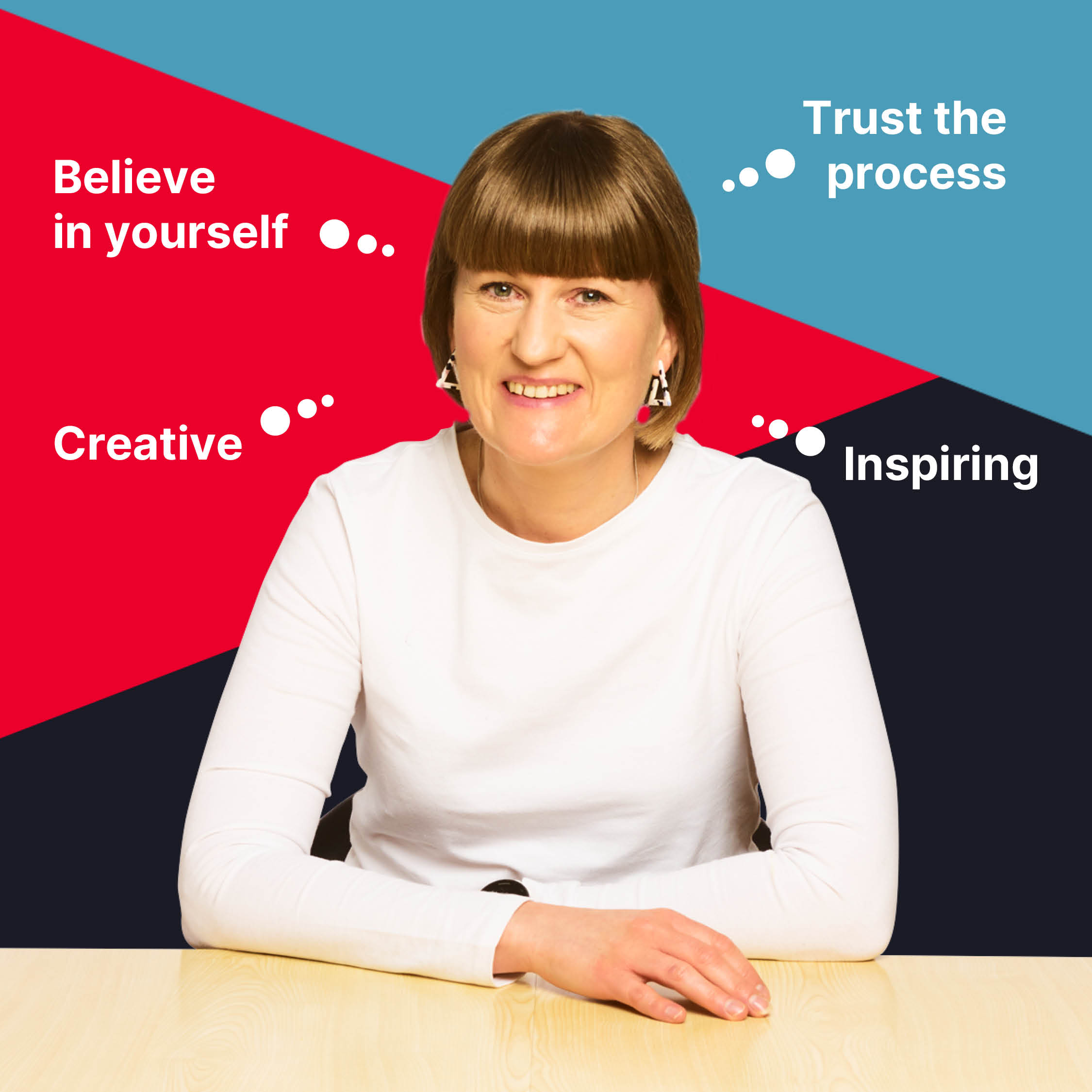
Staff spotlight