Coca Cola. One of the most iconic, recognisable brands across the world. It has come a long way since its origins as a cocaine-laced medicinal drink in the late nineteenth century to the multi-billion-dollar beverage group of today. The brand has its own range of clothing, shoes, jewellery, stationery, homeware, and is featured on every type of merchandise you can think of. From its residency on the world’s most famous landmark billboards to its intrinsic link with Christmas, its ubiquity and global cultural impact is immense. Many people even have Coca Cola tattoos ( some better than others!)
And so, when their branding gets a redesign, it’s understandably big news, prompting lots of discussion and plenty of judgments. None more so than following the just-announced overhaul of their entire Coca Cola drinks range, which seems to be massively dividing opinion.
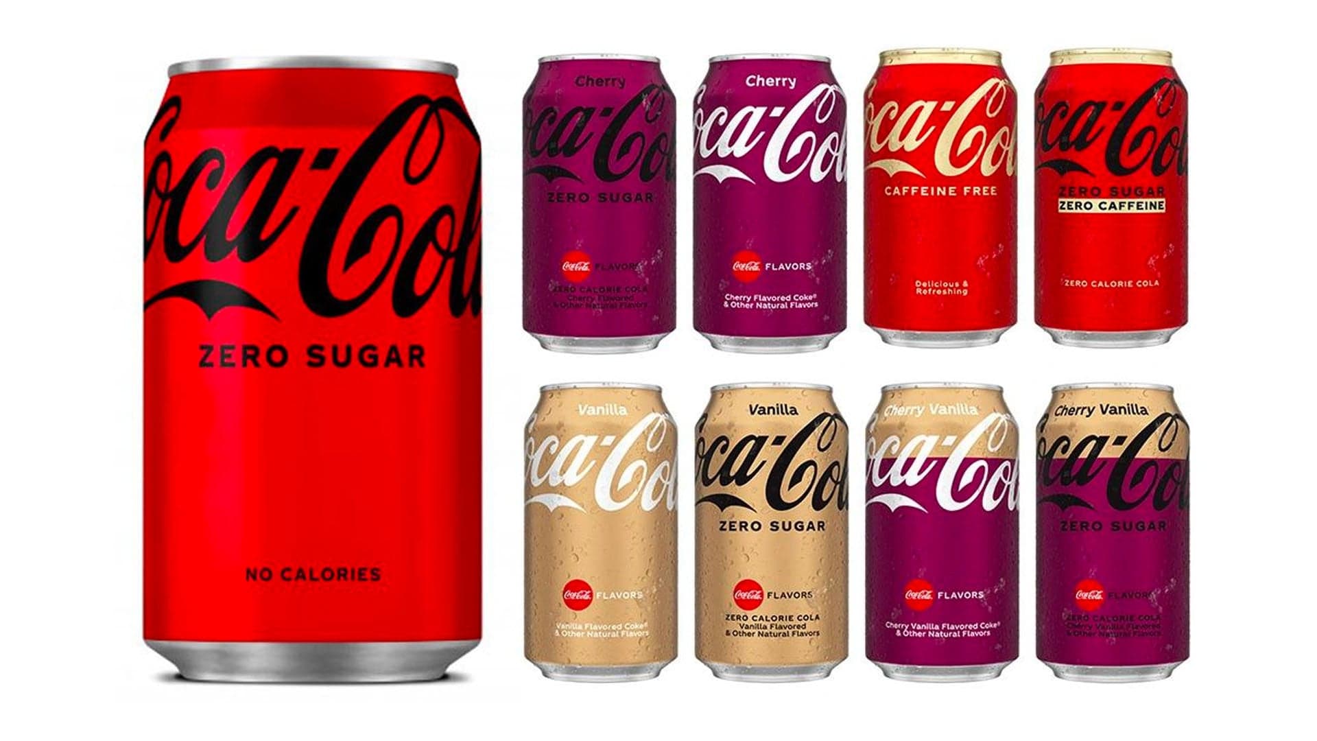
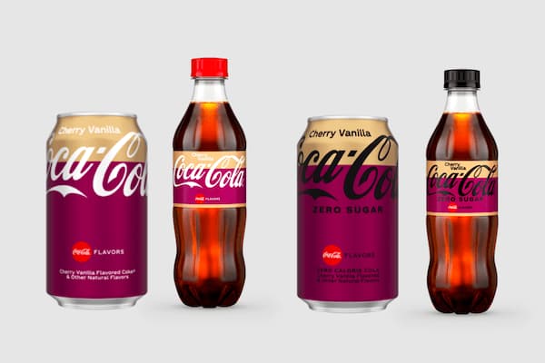
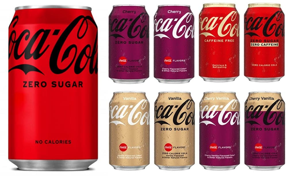
In some ways, there are no huge shocks with the new look. The process began last year with the core products (Coke, Coke Zero Sugar, Diet Coke), which evolved to fit the current zeitgeist of the ‘big flat now’ – lots of flat colour, bold shapes, no frills. There are no additions, like the previous big disc and wavy swoosh; instead, just uncluttered simplicity, with some clear negative space, and a higher-positioned logo. So far, so unremarkable. BUT now they’ve rolled out the new look to the rest of the range: in a bold move, the red background changes according to the flavour. So, Cherry Coke has a cherry-purple background; Vanilla has a gold colour; and Cherry Vanilla has a two-tone purple and gold. But in addition, the Zero Sugar versions have the logo reversed into black (no sugar, so no white – get it?). This all makes every kind of sense – it’s a neat all-in-one visual reference which easily indicates the flavour and whether it’s full sugar or no sugar. “The intent is to provide a simple and intuitive navigation system that carries across all Coca-Cola variants,” the company itself stated.
The problem that this creates, however, is that some of the resulting colour combos are lacking legibility. Some people were already decrying the black on red of the new zero sugar labels, but the flavours further compound the problem – the full sugar vanilla, for example is white on gold; the zero-sugar cherry variety is black on purple, which really lacks clarity, especially when viewed from a distance. And this is what some people are really taking issue with. Is one of the world’s most famous brands now, in some cases, becoming anonymous? Legibility is one of the cornerstones of good design, and if you take that away, you have a problem.
In an age when dynamic, shape-shifting logos are growing in popularity, legibility issues such as these can be solved via animated builds. In a sense, Coca Cola HAVE made their logo more dynamic, adapting it to different products and flavours, but the (ice) cold hard fact is that it needs to work when printed on physical, tangible product packaging, and this is where it’s falling short.
So, does the new look work? Well, it’s based on logical principles. The sugar-white/no sugar-black concept is simple and effective. The flavour colour system looks attractive – and it makes you crave an assortment of other flavour combinations, not so much for the taste as to admire the colour mixes on the cans. It’s not perfect and, yes, legibility is sometimes compromised, but the sheer power of the brand retains recognition without having to try too hard – much like when Starbucks dropped the name from their logo. Pepsi will surely soon follow suit with a rebrand of their own.
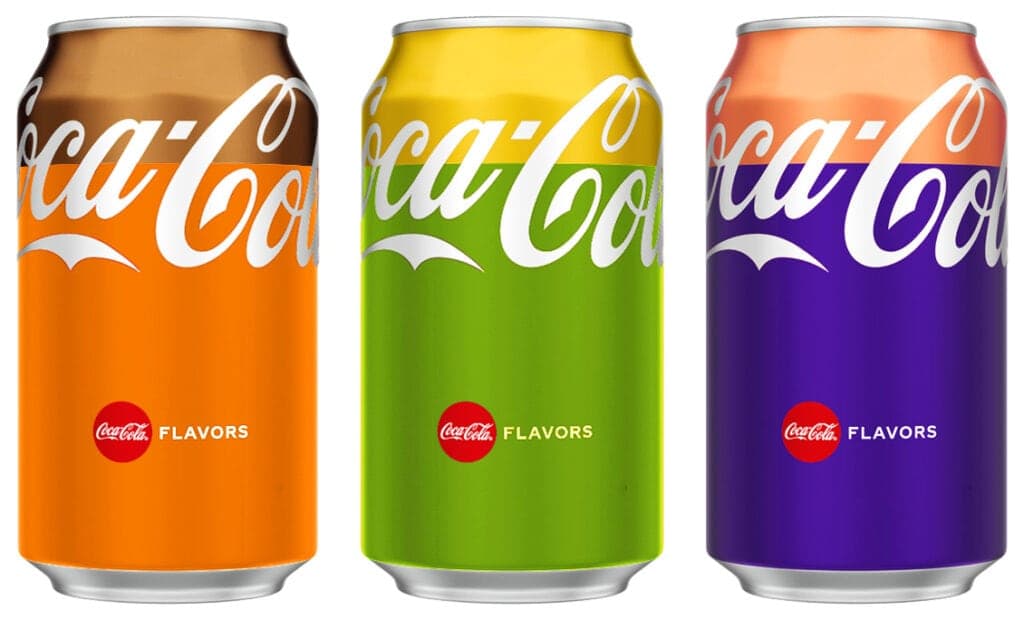
“Fantasy flavours: How orange & cinnamon, lemon & lime, and blueberry & peach varieties could look”
“We wanted to modernise and simplify the look of our packaging to help consumers find the flavour they’re looking for on the shelf,” said Natalia Suarez, senior brand manager of Coca‑Cola’s North America Operating Unit. Just don’t expect people to rush out and get tattoos of the new Zero Sugar Cherry Coke bottle anytime soon!
Thinking about your next rebrand? Get in touch... hello@cwa.co.uk