Blog

Have you ever visited a website and been left feeling frustrated by the experience? The text was too small, the navigation didn’t work, you couldn’t find the information you wanted, or did it simply not load on your device?
Now imagine being visually impaired, photosensitive, dyslexic, or hard of hearing or movement. Unfortunately, this is the reality for approximately 15% of the world’s population who live with some form of disability.
The key purpose of a website is to attract as many visitors as possible. While getting caught up in how a website looks is easy, it’s important to consider the millions of users who rely on websites being accessible to them. Creating an accessible website supports users with disabilities and decreases the risks of losing valuable customers to competitors.
When you go to an agency for help with your website, we’re trusted with the power to remove the barrier between accessibility and imagination and create websites that can be both visually appealing and accessible to all.
We recently had a website refresh of our own, where we took all the following points into account (you can read all about it here). This is when we decided to make this handy guide for when you embark on the same journey.
So, for when you start your website overhaul, here are our 5 top tips to consider for making a website accessible to all:
Making a website accessible doesn’t mean sacrificing the design. Spending the time to understand the constraints will allow you to consider new ideas and creating a better product for all. leaving you with a product that’s clean, fresh, and accessible for everyone.
Contrast is key. Studies have found that in Britain, approximately 3 million people are affected by colour blindness. When choosing the colours for your site, the focus is on making sure the foreground stands out against the background. Put simply, if you’re using a dark-coloured background, use light-coloured text and vice versa.
But it’s important to consider that whilst ‘dark mode’ has risen in popularity, light text on a dark background is more straining on the eyes when read over a long period, so mixing the two styles throughout your design can work to ease the effect on the eyes.
15 seconds. That’s the average amount of time a user will spend on a website. Within the first few seconds, they will form an opinion and decide whether to stay or leave.
Have you ever seen a wall of text and completely switched off? This is where visual hierarchy comes into play. Choosing larger font sizes for headings and key information, splitting your content into defined sections, and using a grid layout are all techniques you can use to boost engagement.
Providing variations like this will not only help those who are visually impaired: key information in larger pull-outs, for example, will help even those who see clearly to get the gist of the website without spending the time to deep dive, which could, in turn, help them stay on the site for longer.
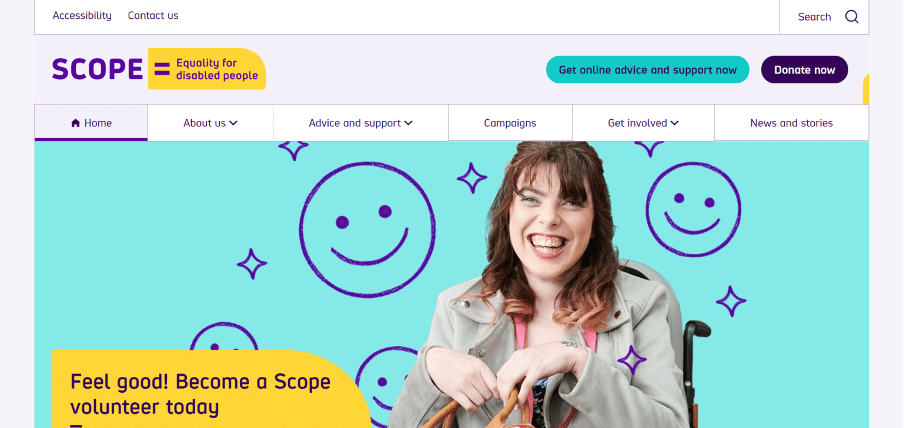
Less is more. To achieve balance, it’s recommended that when creating digital content, you limit your colour palette to 3-4 key colours. When communicating an important piece of information or prompting a response, consider pairing colours with a visual prompt such as increased font size, weight, underline, shape, or label.
Colour should be used to highlight or complement what you can already see - Look at the example below (SCOPE).

Many users are unable to use a mouse and rely on their keyboard tab key to navigate. This includes elements such as drop-down menus, buttons, and forms. By using design devices such as background tints and icons, users can easily determine where they are on a page, removing the need to guess as they scroll.
Accessible websites are better for everyone, both with and without disabilities. The number of people with some form of disability is only expected to grow and by focusing on your website’s level of accessibility, you’ll enhance your user experience for every single one of your visitors.
Do you need help making your website accessible to all? Drop us a message at hello@cwa.co.uk.
News and insights